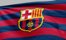
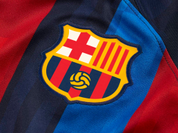
FCBarcelona Crest
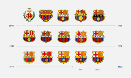
FC Barcelona (colloquially known as Barça) is a professional football club based in Barcelona (Spain) and competes in LaLiga. Its motto is "Més que un club" ("More than a club"). Not only because it's one of the most successful football clubs in the world, but also has plenty of other teams in other sports. Like other clubs, Barça has changed its crest over the years to keep it up to date and the changes respond to specific needs that arise over time.
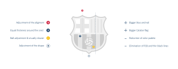
In fact, a few years ago they already presented a proposal made by the brand agency Summa, but they finally declined their crest. I actually thought it was a good approach, but they missed in my opinion in some points, specially in the general look of the crest. The removal of the FCB, however, was the right decision, this crest is being used by more than just football teams, and there are other aspects about the crest that should be empowered: the blue-garnet, the catalan flag and the cross. Also the ball visually better and make other small tweaks and adjustments on distances, thickness and removing innecessary elements. Simplification, unification, rationalization.
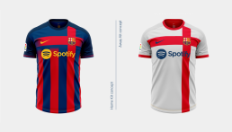
This project is just a brand concept of what FC Barcelona may follow in the future when they redesign their brand, based of course on my opinion.
CategoryConcept,. Branding, GraphicsYear2022


